Cities Squared: Making Urban Data Legible shows new ways to represent data about cities with maps. The complexities of urban geography can make it hard for people to decipher the data that impacts their lives. This book documents an investigation into alternate methods of mapping for plotting data about cities without the scale or shape influencing how that data is read.
£17.95 (plus postage)
64 pages, 171 × 241 mm, softcover, four spot colours
The mapping system used here (equal area cartograms) makes it easy to create glanceable representations of urban space, onto which a variety of data types can be plotted. The individual map units (the squares) provide a simple canvas for using visualisation types that are normally quite difficult to use on a map (e.g. line charts). The system does often require compromises in geographic accuracy, but the trade off is more than made up for through ease of reading.
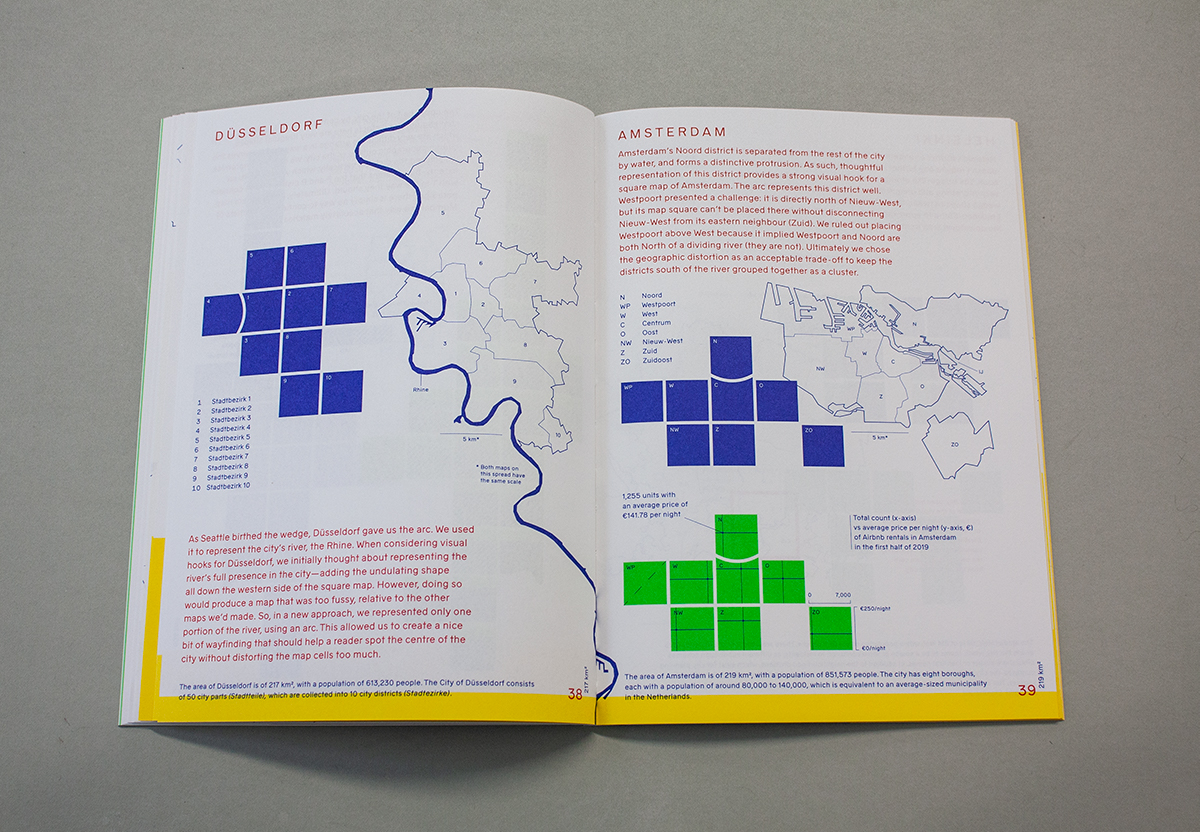
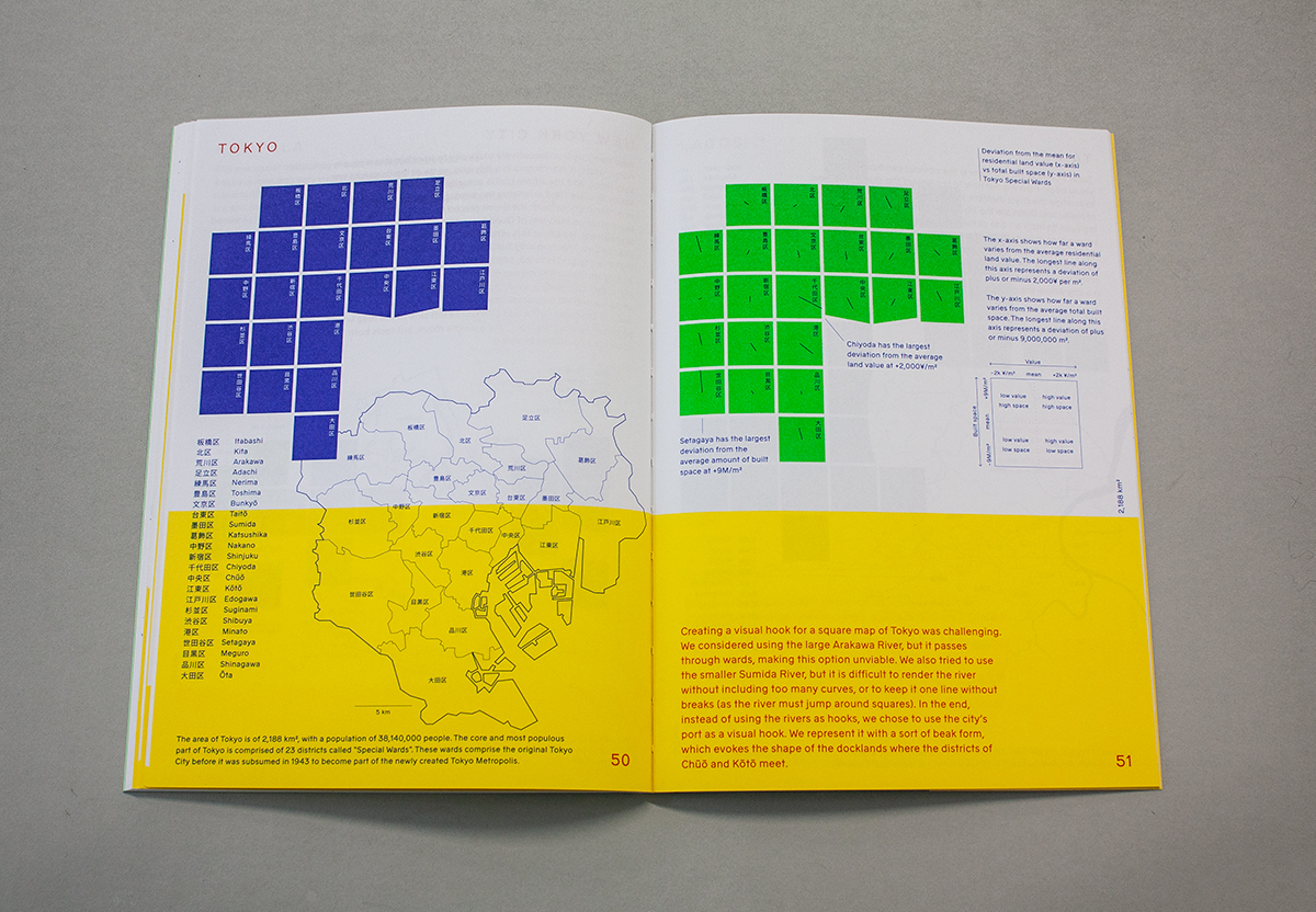
We explored cities from all over the world, including London, Helsinki, Cape Town, and Seoul, to create a set of maps that illustrate the method. Each city featured includes a square map and a breakdown of the process involved in creating it.
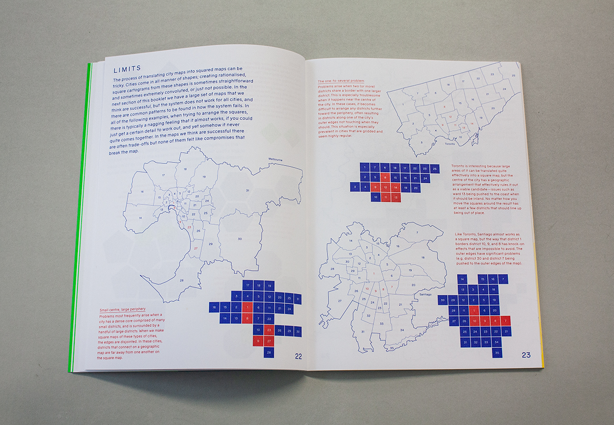
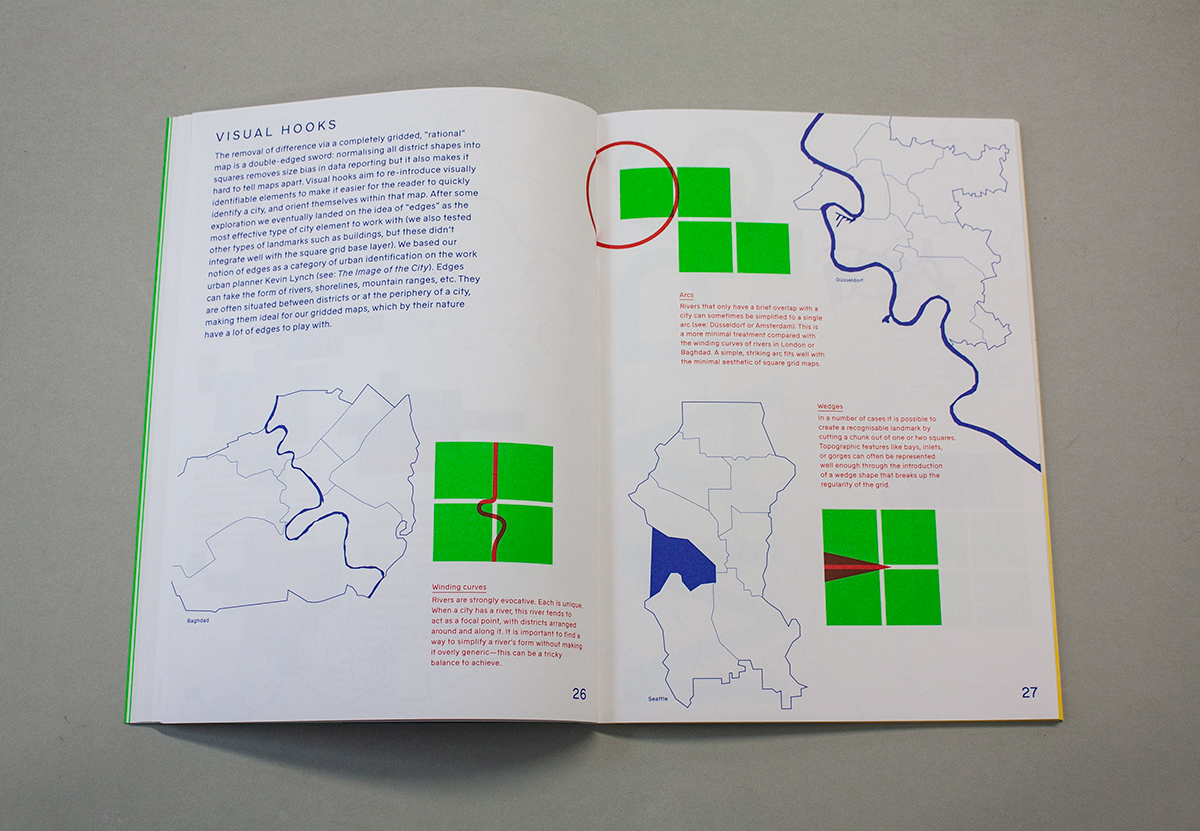
Beyond the finished maps, the book also documents the theory and process of making these maps, to help readers understand how and why we undertook the project. We illustrate both the keys to making a successful square map and also the limitations of the method.
For more, Dan Hill expands on the introduction he wrote for the book, writing about “the broader context of data about cities, models of cities, and understanding and visualising cities”.